Monday 30 November 2015

Filming Schedule - Miss Miller

A filming schedule is a project plan of each days shooting of a film product, in our case a music video. The filming schedule provides a plan of what is going to happen and be including in each shot of a film production, therefore guiding group members on what to do. This informs me and my group members the brief subjects and equipment we need in each shot, so that we know what we have to film on the day. If we were not to have a filming schedule, we would not have a clear idea of what we would have to shoot whilst filming our music video, as it'll be chaotic because everyone would be frustrated and rush shooting since it'll be made on the spot. Therefore, the filming schedule acts as a guide for our filming, and will help us shoot smoothly and efficiently.

What is included in our filming schedule is: Shot, time and date, location, content action, shot types & duration, costume, hair & make up, iconography, personnel and equipment. 


We followed our filming schedule when filming the bonfire/fireworks on the 5th November. Also we included the cinematography planned in the schedule especially long shot to convey the setting. However we added an additional shot; establishing shot to show the scenery that the couple was in and also their body language. However there were sometimes where we couldn't film, for example the field scenes that were meant to be filmed on the 7th November. The reasons to why we did not film was due to the weather which was extremely windy and raining, therefore this would have been difficult for us to film and get efficient shots for our music video of the artist singing. Therefore, we decided to film on the 10th November, where it was less windy and there was no rain, also the sun was out, so our shots of the artist in the field came out as we wanted because we were able to capture good footage where the lighting was good and the artist could perform efficiently.
Another scene that we couldn't film was the Camden market scene on the 14th November because some people were not able to make it on the day scheduled. Therefore we planned to film another day for the scene where everyone could come and also we filmed additional shots whilst being in this location. The additional shots that we filmed were at Camden, and these included more shots of the scenery e.g. flamboyant shop signs and jewellery at the stalls. The reasons why we decided to film these additional shots, is so that we can include them within our music video to convey the location that the characters were in further so that the audience understood where they were more. Also, the additional shots will act as fillers so that the music video is not solely narrative based and keeps it more interesting to watch for example a shot of a colourful 3D elephant on a shop sign. Another time we didn't follow our filming schedule was for the field scenes that were meant to be filmed on the 7th November. The reasons to why we did not film was due to the weather which was extremely windy and raining, therefore this would have been difficult for us to film and get efficient shots for our music video of the artist singing. Therefore, we decided to film on the 10th November, where it was less windy and there was no rain, also the sun was out, so our shots of the artist in the field singing came out as we wanted because we were able to capture good footage where the lighting was good and the artist could perform efficiently.
What I learnt from having a filming schedule when filming a media project, is that it keeps the group organised by informing us what exactly were filming, when were filming it and what equipment we need. This was helpful as it made our filming experience less chaotic because we knew what we were doing, so if there were going to be any complications such as bad weather, we still would know what to film on the next day we film that particular scene.

Thursday 19 November 2015

Planning Editing Styles - Miss Miller*

A variety of editing styles and techniques are essential within a music video. This is because it helps piece the music video together in either a flowing way or drastic way to appeal to the target audience of which genre. For instance a pop music video will include drastic editing styles and effects such as CGI to convey the escapism that it tends to bring. Also, editing styles are important in representing the artist and showcasing the narrative or concept of the video, as it gives the audience more understanding of the genre. 


The first editing style that will be used in our music video is a montage. A montage is a series of short shots that are edited into a sequence to condense space, time and information. They are used through repletion of images, through cutting rhythm,detail or metaphor. A montage will be seen in my music video in the market scene. I was inspired to include a montage in our music video from Gabrielle Aplin's Panic Cord music video, as she had one when she was seen with her boyfriend walking along the beach. The montage will showcase the couple walking through the market, their facial expressions, the public and the items that they are looking at the stalls at etc necklaces. The use of this editing style creates excitement and makes the scene interesting to watch. Also the different shots shown will help appeal to the niche audience due to the creativity and they may feel a sense of escapism from the artist through the use of the different shots in the montage.In addition, the montage makes the scene look more sentimental and fun for the couple as it showcases them as being happy and active with one another, which helps convey the happy memories within our narrative. Furthermore, the montage will represent the artist as in love and content as the different shots will show her facial expressions and activity which convey her feelings towards her partner e.g holding hands, smiling.  A montage is conventional to the indie genre, as it helps establish different things within the scene to the audience such as the artist's facial expressions, what they're doing and where they are at which helps make the narrative or concept more understood.

The next editing technique that will be used in our music video is slow timing of shots. This is when a shot is slowed down and this will be used in the field scene when the artist and her friends are dancing around in the coloured smoke. The use of the slow timing shots will show the characters facial expressions and body language clearly and exaggerate their current emotional state which will be of happiness and liveliness. Also, it'll help convey the happy side of the artist in the narrative as it shows her in a joyful state with her partner and friends and highlights her happiness which the audience may admire. The audience will be appealed by this as the slowness captures the lively scenery that the artist is in, and they could relate to this as it shows the fun they are having and the target audience are known to having fun and being rebellious. Also, the slow timing of shots will be used to show the romance between the artist and her lover as it allows the audience to see how they look at each other and also their actions to one another e.g leaning for a kiss. The slow timing of the shots will show that they are both happy and have strong feelings for one another but also it will intensify the moment that they are in and give it a more intimate feel. This will appeal to the audience as it shows the narrative clearly of there being a relationship within the music video, but also it emphasises their love which the audience may admire and relate to. This builds a relationship between the audience and artist, as they too may relate to their relationship of being intimate and happy which the slow editing captures. In addition, the slow timing of shots will represent the artist as reminiscent, as the slowness of the frames will make them last longer, therefore portraying how the artist wants to indulge every bit of that memory with her partner. This may make the audience empathise with the artist, as they may relate to her in looking back at good memories and looking at every small detail of them. 

Another editing technique were going to include in our music video is filters. Filters help create a different colour effect to the frame and makes the scene look different. We are going to use a sepia filter in our music video to make some scenes look old and vintage. This will be most likely used in the market scene or field scene when the artist is with her friends having fun in the smoke. The sepia filter will accompany the narrative by showing that the actions that are happening in the frame are old memories, however they are happy memories since they're not in a dull colour and dark like it'll be for a black and white filter. I was inspired to consider having a sepia filter in our music video from Lana Del Rey's music video Summertime Sadness where she too used it to convey the memories of her relationship. Sepia filter is conventional to the indie genre because it helps convey the past in a mesmerising and warm way which gives the scene a personal feel to the artist. This builds a relationship between the artist and audience as they feel like the artist is allowing them into her past and getting to know her a bit more which makes it feel like they have a bond. The sepia filter will represent the artist as fun, energetic and content as it'll exaggerate her happiness portrayed within the scenes and make her relatable to the target audience because she is seen having fun. The sepia filter will enable the audience to empathise with the artist due to her showcasing her fun side with them which they may be able to relate to, as 17-25 year olds are stereotypically known to be lively and energetic.  We also may have black and white filter to show the bad side of the relationship as the artist lover doesn't want to be publicly out there in their relationship. The black and white filter will give the frame a sad feeling and convey the emotions of the artist and her lover of being quite down. Black connotes darkness, power and mystery which could be applied to the video as it will imply how the relationship has its dark sides and how the artist's partner is in control of how it is. Also, white connotes innocence, vulnerability and youth which portrays the artist within these dark memories as innocent and oblivious as she's submissive to her partner and is blindly in love to not fight for their relationship to be out in the open. Therefore, a black and white filter is conventional to the indie genre, as it creates a rustic look and also conveys the frame as old and in the past which is useful for showing memories. 

Last but not least, the editing style; fade will be used in our music video. A fade is a simple transition style used in the editing process and it is usually used at the end of a film or video. A fade to black will be used in our music video at the end of the music video which will show the artist putting away the photographs of her and her partners memories. The use of this fade transition between the shots is to make the video flow and give it more sense, so that the audience know whats going on clearly. Also, the fade to black at the end of the music video will clearly state to the audience that is the end of the music video, However it could also portray the end of the relationship that the artist was in. Due to the connotations of black being enigma and enigma, this could be applied to the music video as connoting that the relationship is still a mystery and the audience do not know whether its officially over or not as it leaves on a cliff hanger. Also, in reference to power, the fade to black could portray the artist as self controlling herself and taking power to the situation and implying that she's moving on since we see her put away the photographs during this editing style. This editing technique is conventional to the indie genre as it helps connect shots clearly and also it is used at the end of an indie music video to convey that it is the end of the narrative, giving the audience some clarification. The fade to black represents my artist as mysterious as it signs of the video and makes the audience want to find out more about her, since its ended on a cliff hanger through the fade. This representation intrigues the audience and grabs their attention to her as an artist which helps her build an audience since people would want to know more about her. 

Planning editing has been helpful in visualising the types of editing styles or transitions we will include in our music video. Also, it's made clear of the reasons why certain styles are being chosen and how they're conventional to the indie genre so that it is a successful video. In addition, it has allowed us to examine the representations and effects the editing styles have to portray the artist so that it gives the audience further understanding of the artist and how she feels within the narrative. Overall, I will look back at this post and see what editing styles I need to include in our music video and hope for it to help make our music video successfully conventional to the indie genre. 

Risk Assessment - Miss Miller*

A risk assessment is simply an examination of what in your production or work could cause to harm people or the workers. The purpose of a risk assessment is to iron out all the potential hazards and risks that could happen and what you could do to prevent it in order to work in a healthy and safe environment. In reference to my music video, the importance of a risk assessment will inform me and my group members what risks could occur whilst filming. It will provide us with the efficient knowledge or what hazards could happen and how we can prevent them. If we were not to have a risk assessment, me and my group would not be fully aware of the possible risks that could occur whilst filming our music video and we could be in danger or even gain an injury. Therefore, the risk assessment will outline the possible risks and how we prevent them which will make our filming more efficient. 


Above is a table that I created of Microsoft Word. The purpose of the table was to create a risk assessment for the filming of my music video. The layout was simple and there are 5 columns. The first column was where I put down the risks I could encounter whilst filming. Next to it was a column named " Who could be harmed", here I stated the specific participants that could get harmed at that particular risk. The third column stated the impact it could have on the participants and filming and the fourth column explained how I could manage the risk. Therefore illustrating how me and my group could prevent encountering the possible risks. Lastly, the fifth column is where I put down the back up plan for the prevention before, so that I will know what to do after if the first risk management was not effective. The table helped structure my plans as it gave me a step by step run through of highlighting the risks and how to prevent them from happening and overcome them. 

Overall, me and my group followed the risk assessment, as we believed it was beneficial when filming, increasing our safety. The role of the risk assessment informed us the risks that could happen whilst filming our music video, which alerted us when filming as we knew how to prevent them and what our back up plan was. For example, the risk of rain happened when we were filming at camden for a little while, and what we did to prevent it was just put an umbrella over the camera so that it wouldn't get damaged. In addition we made sure all team members and actors wore appropriate clothing to suit the weather that was occurring e.g coats and umbrellas. Therefore, this didn't affect our filming as we were still able to film the shots that we needed when it was raining slightly and also it portrayed realism of the setting because it wasn't artificial. Also, another risk we encountered was slipping on mud whilst filming the bonfire/fireworks and field scene when the artist is singing. We prevented this by checking the weather to see if it was raining on our filming days and if so, we made sure everyone wore appropriate footwear with grippy soles to the scenes so that no one would be harmed and hurt themselves whilst filming. A risk we came across whilst filming was from the smoke canisters. As stated in the risk assessment, the smoke canisters could harm the actors and videographer. When filming the smoke scene, with the first colour, we found that the smoke was hurting the actors eyes when we directly had the smoke placed where they were. Once we identified this problem, we immediately took the advice from the risk assessment of having a practice run of the smoke to see how it'll react like and figured out how the actors will be in it. The conclusion we came up with was by having someone hold the canister whilst the smoke is going and control the direction the smoke came out. Also by doing this there was minimal smoke that wasn't too heavy and the actors could successfully run through it and perform their actions in the smoke. In conclusion, my group did not encounter additional risks and those that did come up were stated in the risk assessment. Therefore our risk assessment was beneficial and effective as it prepared us for what risks could possibly happen and told us how to prevent them. 

Saturday 14 November 2015

Planning Individual Digipak - Miss Georgiou


There are differences between a digipak and a jewel CD case. CD case has 4 sides whereas a digipak has 6 sides providing more information and detail. Jewel CD cases are limited to only providing little information in the front and back which usually is just the front cover and the track list. However a digipak has 6 sides which allows more opportunity for visible artwork, information (such as lyrics) or promotions. Unlike CD cases, digipak's usually contain a letter/note from the artist directly to the fans, giving it a personal feel and insight of the artists lives. Digipak's help further promote the artist as it allows them to further express themselves other than through the music to the audience. This is effective as it makes the audience feel that album is made especially for them, it also gives more them knowledge about the artist and intrigues them to find out more about them. Therefore, increasing sales of the album due to the curiosity of the audiences that want to find out more about the artist 
I have gathered inspiration from Gabrielle Aplin's digipak and Lana Del Rey's magazine advert to assist me with the creation of my own. For example, the layout of Gabrielle Aplin's front cover of having the text in the middle inspired me to incorporate this within my digipak. Also, Lana Del Rey having a mid shot in her magazine advert, inspired me to include mid shots of my artist as I believe its effective when promoting the artists as you can see her facial expressions and body language. My digipak will be for my artist, Sharna Rae and it will include her debut album 'Illuminate' that features the hit song 'Wings' by Birdy. My digipak will have 6 sides which will include a front cover, back cover, CD and personal message for the fans of my artist. 


The layout and design of my digipak throughout will be quite similar, for example all text will be aligned in the centre and this will be seen on the front cover, track list and personal message sides. Also, the images shown on the digipak will see the artist positioned in the middle in a natural environment e.g field or forest,to follow the convention of the positioning. Positioning in the middle is conventional to the indie genre as it further promotes the artist and makes her the focal focus to the audience/reader as she is placed in the centre. Also, indie artists tend to be low key or unknown, so by having the imagery of the artist in the middle helps make sure the audience know who the artist and establish the face that belongs to the songs. An example of this would be my front cover which shows the artist positioned in the middle looking back over her shoulder into the camera in a field. This shot will be a mid shot that'll show the artists body language and facial expressions and help convey her emotions subtly. The reason why I chose this particular imagery for my digipak is because I believe it will be effective and promote the artist successfully. This is because there is nothing going on around her, and she is the centre of attention even though she's got her back to the audience, this appeals to them as it creates enigma and makes them want to find out more about her. Also, the artist having her back to the audience could portray her as an introvert which is common for an indie artist to be, as it shows that she is shy because she's not fully presenting herself to the audience. However, by having her look back could imply how she is slowly moving towards the audience and is allowing them into her life through her music because she feels like she can speak through her music. Another reason why I think having her positioned in the middle and looking back on the front cover is effective, is because it gives hints of the narrative for my music video which is about the artist looking back at memories of her complicated relationship with her partner. Her looking back foreshadows this as it implies that she is looking back into the past, and the field setting shows that she is free from her past but still misses it. Going back to the natural theme of having the images show the artist in a field and forest in my digipak is conventional to the indie genre. This is because indie artists tend showcase themselves in real life settings that the audience can recognise so that it showcase realism. In addition, it adds to the context that indie artists express within their music which is most likely to be about real life situations or personal experiences for them, so by conveying themselves in a natural setting in the digipak it makes it more believable. 


There will be 3 types of imagery in my digipak that will show the artist; on the front cover and last two sides. The first imagery which is on the front cover, will show the artist looking back into the camera in a field as explained above. The second image of the artist will be of her walking on a pathway through a forest with her guitar behind her back. The reason why I chose this image is because it links with my music video well of showing the artist with a guitar in a natural environment. Also her walking through the forest creates a sense of escapism in the image, as it implies that the artist is on a journey and the fact that she's got her back faced to the audience gives the impression that she's willing to go on this journey with them. This appeals to the target audience of 17 -25, as this age group tend to be looking for themselves on who they are and going on journeys to discover themselves. Therefore the artist makes her self look relatable to her audience and build a relationship with them because they can emphasise with what she's going through. Also the location of a forest creates suspense and enigma within the image as forests you don't know what's in them and also they're quite gloomy. This represents the artist as brave, careless and adventurous as she is brave enough to go through the forest, but also shows that she's interested in the unknown alone. However, it could suggest that she's on a journey through her music in her album and wants to take the audience along with her on this journey, as the shot used in the image makes it look like the audience are following her. Furthermore, the image shows her carrying a guitar behind her and this establishes that she is not only vocally talent but instrumentally too. This is conventional to the indie genre as artists tend to use instruments to further express their emotions and feelings in their music videos. Also, the guitar gives a hint to the audience that she can play it which makes them admire her for conveying bits of herself on the digipak, feel like they know more about her as a person. The next choice of imagery in my digipak will be of the artist in the forest or field standing, tilting her head up whilst her eyes are closed. She will be positioned in the middle as stated before, and blue smoke from the smoke canisters will be covering her in the mist. This will give a sense of escapism to the digipak as the artist is covered by the smoke which portrays her as mysterious. Also, the fact that she's looking up in the smoke could connote her dreaming, as the smoke could portray clouds and her being in another world in her mind. This could foreshadow how her music will be like, for example being optimistic and dreamy because she has eyes closed whilst being in the smoke. This appeals to the audience as the smoke created enigma for the audience and make them wonder whats she's hiding from or want to mirror the state of mind she's in. My CD will have a image of a variety of photographs of the artist and her life. The reason why I chose to have photographs on my CD, is because it foreshadows what is going to be seen in my music video, which is the artist looking back at pictures of her relationship. The photographs on the CD connote memories which is conventional to the indie genre, as the artists within this genre tend to sing about their life experiences of the past. Also, having the pictures on the CD implies to the audience that the artist is sharing her life to them as they see elements of it through the photographs which helps build a relationship between the artist and the audience. Also I believe the photographs makes the digipak look more sentimental and meaningful for the artist as it showcases that is isn't afraid to share herself to her fans. 

The typography used in my digipak will be similar to the one used in my magazine advert. This provides a certain theme for the album and further promotes it as people can link the two together and know what it is for. The typography for the artists name; Sharna Rae will be in capitals and the colour orange just like in the magazine advert. Orange connotes happiness, warmth and happiness which could foreshadow the themes of having fun within the album as well as the music video for Wings. This appeals to the audience as the colour catches their attention which showcases her name so that it'll be remembered. This particular typography will be positioned at the top of the front cover, in the middle, above the artist which I gained inspiration from Lana Del Rey's album covers. By having the typography above the artist and in the middle, it further puts a name to the face below and states to the audience who she is and what her name is. However, unlike Lana Del Rey's typography of her name, mine will be a smaller font to the album title, which is subversive to the indie genre. The reason why I chose this is because I want the audience to know the album title more than her name, so that it creates a sense of eeriness to the artist and makes them want to find out more about her. Although it is subversive to the indie genre, I believe this will challenge to convention of having the artists name in a larger font than everything else, as I think it'll have a bigger impact on the audience finding out her name, as they'll notice it is not giving much away. Therefore, this appeals to the audience because its unconventional to the genre, which will make them want to find out more about my artist and portray her as unique. The next typography that will be seen on the front cover of my digipak will be of the album title "Illuminate" in the colour yellow, again the same as my magazine advert. The colour yellow connotes brightness, enlightenment and happiness due to its brightness and this also represents the word illuminate as it means to provide or brighten with light. This conveys the concept of the artist debuting herself to the world, as the colour of the typography as a spotlight on the artist because it grabs the audiences attention. Like the typography of the artists name, the album title will too be in capitals and this is because it catches the audiences attention and gives importance to it. Another typography that'll be seen in my digipak will be the track list, and this will be in capitals and the font Times Roman or something similar on photoshop. The track list typography will be in the colour black and positioned in the centre. The colour connotes darkness, enigma and power which foreshadows the theme of a complicated relationship that the artist is in my music video for the song "Wings". Therefore creating enigma for the audience to find our the stories behind the track list and makes them want to buy the digipak. Lastly, the typography for the personal message of my digipak will be in a handwriting like font and will state " I appreciate all the support and love you give me, and I am forever grateful. With this album, I hope to spread my wings and for you to do so too, Sharna x". The reason why I chose the personal message to be in black and a handwriting font is that it gives a personal feeling towards the digipak and make the buyer feel special. 

The style of language for my digipak will be simplistic, especially in the personal message. The language used in the personal message will be informal so that it illustrates that the artist wants a friendly relationship with her fans. Words such as "I" and "You" make the audience feel like artist made the album especially for them and make them feel special,and that they're having a conversation with the artist through her music. This differs from a jewel CD case, as they wouldn't usually include a personal message or the message wouldn't feel personal as the record label may of advised the artist on what to right just for sales reasons. Therefore it lacks authenticity of the album which is a key element for indie artists as they portray themselves as ordinary like the audience. This is why the language for my digipak will be informal because it makes it look like its coming from the artist themselves and more sincere which appeals to the audience and makes them value the album. 

There are a few conventions that I have included in my digipak. Firstly, I have followed the convention of showing the artist in a realistic setting through the chosen images of my artist being outdoors; field and forest. This is conventional to the indie genre, as artists are prone to convey themselves in real settings so that the audience can relate to them and also convey realism. This gives emphasis on the themes of their music, as they tend to be about real life experiences or personal to the artist, therefore showing themselves in a real setting portrays the artist as genuine and ordinary. This differs from a jewel CD case, as the sole purpose of one is to gain sales, this means that CD cases would be extravagant and flamboyant from the artist so that it shows the escapism. However, since my artist is an indie artist and wants to show realism, having a real life setting in the digipak emphasises this and appeals to the target audience as they feel its for them. Another convention that I have included within my digipak is the camera shots; mid shot and long shots. A mid shot is used in my front cover, and long shots in the last two images. All shots show the artist and the purpose of them is to show artists facial expressions and body language. The shots are conventional to the indie genre, as they show the artists surroundings and themselves which gives the audience information of what is to be expected within the album.

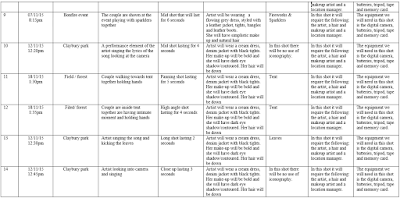
Planning my digipak was useful in relation of taking pictures for my actual digipak as well as preparing me in how to use photoshop and what to include, because it has given me a rough look on what it will actually look like. The planning has assisted me with more time for the actual making of it, as when I get on photoshop, the planning will assist me as a draft to follow with. It has allowed me to establish the different aspects that I will have in my digipak such as colours and images from the photoshoot, which makes it less time consuming when creating it on photoshop.Therefore, this will be less chaotic for me and also make me make my digipak effectively as I would know what to include and have time to invest in the creation to make it successful. 

Sunday 8 November 2015

Group Storyboard - Miss Miller

Frames 1 - 4 
Frames 5-8
A storyboard is a sequence of drawings, typically with directions and dialogue, which represents the shots planned for a film, television programme or in our case; a music video. When it comes to planning, storyboards are important because they are the best way to show your vision of the production that you are creating. The purpose of a group storyboard is that it allows all members to discuss, evaluate and put forward ideas to create an overall vision of their end product. Another purpose for creating a group storyboard is that it allows us to plan ahead what we are going to include in our music video in terms of the micro elements; cinematography, mise en scene, editing and style of video. If we were not to have a storyboard, it would be time consuming when it comes to actually filming our music video, as we wouldn't know what to do nor include when filming. Also, the editing process will be chaotic because we would be making up styles on the spot. Our storyboard will guide us on what to do and include within our music video, which will help make the process as successful and conventional to the indie genre possible. 

My group consists of myself, Rishika, Bettie and Jess. The storyboard made was for our chosen song 'Wings' by Birdy, which will be the song for our music video. 


Frames 9-12
Primary research is research carried out yourself for instance; questionnaire. Me and my group carried out a questionnaire for our music video and the indie genre to find out what the audience expect to see in an indie music video. Questions asked included; what setting do you expect in the indie genre, what type of instrument and camera shots etc. Most answers were conventional to the indie genre,and helped assist with our planning process for our music video for the song 'wings' by Birdy. We also carried out secondary research throughout the whole of the project, and this was through our blogs where we analysed and researched different genres, music videos, the indie genre and our artist to gain more understanding of what to include in our own video. With both our primary and secondary research, we have taken several inspirations from them and tried to incorporate them into our indie music video, so that our video will be as successful as possible in regards of the indie genre. 


Frames 13-15
The way me and my group storyboarded our music video, was through sheets of paper that showed drawings and descriptions of what was going to be included in each frame of our music video. This included; the micro elements, narrative description and duration of the frame. This gave us a clear image of what we were going to create and also acted as our guide when we were filming, as we would always look back on the storyboard to see what was next to film. The way we shared the responsibility of the storyboards, was that in class we all started on the first 3 frames together and discussed the overall narrative and how it'll be in greater depth. After this discussion, me and Rishika took responsibility to finish the rest of the storyboard off by halving the amount of sheets between us and communicating at home whilst home filling them out. Through our group chat, we discussed the inspirations that we all had and plotted these within our music video. Our ideas of what we would incorporate into our storyboard, primarily stemmed from our lyrics analysis annotations. 

An inspiration that we gained from our secondary and primary research was the use of an instrument especially a guitar. In our questionnaire, the majority said they expected to see an acoustic guitar within an indie music video and our secondary research into the artist, Birdy, we found that she played the piano in her music video 'Skinny Love'. This gave us the knowledge that indie artist tend to play an instrument within their music video and the instrument tends to be an acoustic guitar. This inspired us to include a guitar within our music video, and as seen in the storyboard, frame number 31, our artist will play a guitar whilst being in the field through the use of a long shot for 7 seconds. We believed this was appropriate to include in our music video as our research proved it to be conventional to the indie genre, as it allows the audience to know that the artist is not only vocally talented but instrumentally too. Also, the use of the artist playing in the field in particular, gives the impression that she is expressing herself to the audience in more depth as she is in an isolated place where she is seen to be 'free' and this implies that she is being herself. This builds a relationship between the artist and the audience, as they will feel the artist is being genuine and honest about what she's singing about but also they can empathise with her because she's allowing them in. Therefore, the use of the acoustic guitar in our music video is conventional to the indie genre and also helps builds an artist and audience relationship. 


Another inspiration that we got from our primary and secondary research was the use of close ups our music video. Our primary research; questionnaire results of 'what camera shots do you expect in an indie music video',had close ups as the overall answer. In addition, my secondary research of analysing Lana Del Rey's Summertime Sadness music video, she had close ups of her face and objects such as the shattering light bulb. The research inspired us to include close ups throughout our music video and examples of this are in the storyboard. For example a close up is used in frame 20 and this is accompanied with a zoom in. The close up establishes to the audience the narrative of the artist trying to hold her partners hand but then she moves away from the action. The close up highlights the fact that the lover does not want to be public with their relationship and show affection towards her. Therefore, the close up used is conventional to the indie genre, as it helps the audience establish the narrative through the purpose of a close up magnifying something. In our case it magnifies the struggle the artist is in, in relations to a complicated relationship. Another time were going to show a close up is when the artist is singing, for example frame 50 we see the artist singing through a close up the lyrics "For the rest of our lives". The purpose of the close up is to capture the artists emotions that she expresses through her facial expressions whilst singing of distress and sadness which further gives understanding of the narrative. The close up is conventional to the indie genre as it shows the artists facial expressions and also makes her the focal attention which appeals to the audience. Including close ups in our music video, does not only follow the indie conventions, but also Goodwin's theory of "record label including the need of lots of close ups of the artist and the artist may develop motifs which recur across their work. We incorporated the theory by showing the artist throughout the music video in a close up. We followed this because we thought it'll be essential for the indie artist who is debuting to promote herself by showing her face frequently throughout. Also, the use of close ups helps build a relationship between the artist and audience, as it gives the impression of the artist allowing her audiences in because they see the emotions she is expressing. This may make the audience emphasise with what she is portraying or singing about in her music video, which will make them admire her as they feel she's being genuine and honest. Therefore following Goodwin's theory and a convention of the indie genre, as indie artists tend to be low key or unknown and need further promotion especially if they're debuting. 

Our next inspiration that we gained from our research was the use of the artist wearing casual clothing. This stemmed from our questionnaire question of 'what types of costume would you expect in an indie music video" and the majority said casual. Also, in our indie genre research we all found that indie artists such as Gabrielle Aplin, Ellie Goulding and Lana Del Rey had all worn a casual outfit within their video. So with the knowledge of indie artists wearing casual clothing, we wanted to incorporate this within our music video to show our narrative and include it in our storyboard. For example scenes such as the bedroom and fire works scene, our artist is wearing comfortable, casual clothing that suit the setting such as jumper and leggings or shirt and jeans. This is evident in frames 2-4 and 8-9 where we see the artist the outfits mentioned. The use of having the artist wear causal clothing is conventional to the indie genre, as it portrays her as normal and ordinary which makes the audience feel like she's one of them, which helps build a relationship between the two. Furthermore, the casual clothing portrays realism within the video, as they suggest the ordinariness of the artist is authentic and that she is truly showing herself in her natural form. This again is conventional to the indie genre, as artists in this genre rely on realism to convey their narratives or concepts as they tend to be about personal experiences or their life. So the use of having casual clothing accompanies this, as it shows that the artist is being real to her audience and makes her song more believable or understanding. 

The storyboard was helpful to our filming as it prompt us with the ideas and visuals of what we were going to film, making it our guide. This made sure that our filming process was less time consuming and more organised which decreased the level of chaos that would happen. Also, when filming we would always look back on our storyboard to refresh our minds of our music video outline, and this made sure that we didn't forget to include anything.

In summary, we have tried to follow our storyboard and some areas have been successful. For example the bonfire event scene, we did follow the storyboard and filmed what was said to be filmed in our storyboard in our music video. The shots, editing techniques are the same and also visuals. However, there were a few changes within frame 2, as we included fillers such as shots of the funfair rides at the event in between our shots. The reason why we did this was because we didn't know the event would include fun fair rides, and we thought it would help establish the setting that they're in, as well as portray the artist as youthful and innocent. Therefore, the fillers of the rides and fireworks served its purpose of portraying the artist and the narrative further e.g fireworks represent the excitement and sparks of the relationship. Also, we did follow our storyboard when it came to the bedroom scenes; artist looking at photographs and the couple on the bed. We incorporated our storyboard frames that we planned into our filming and captured the scenes in the shot said such as high angle shot of the couple laying down on the bed; frame 34.